

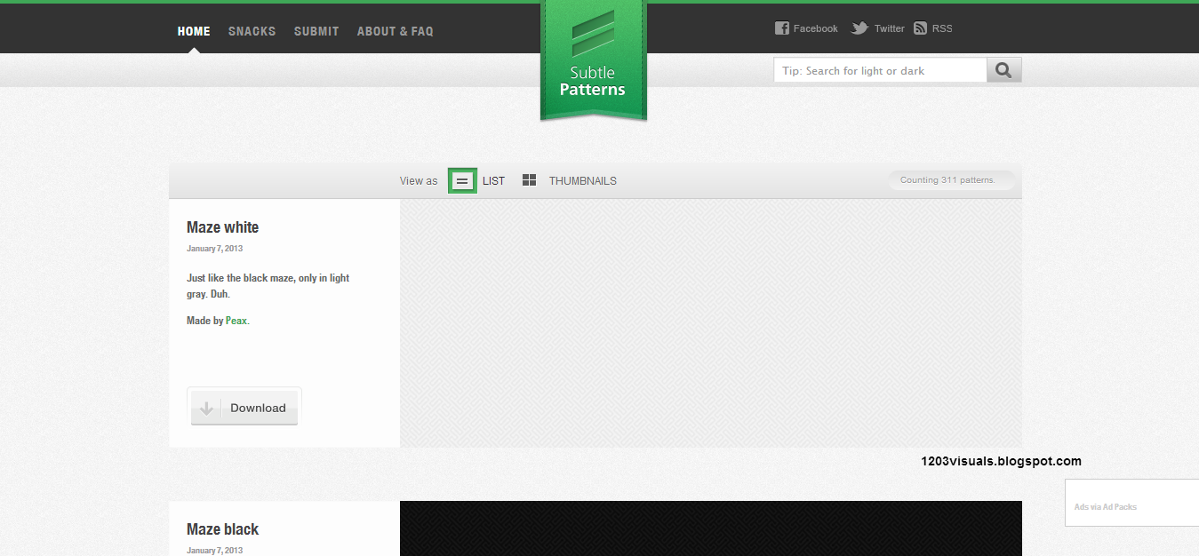
With a subtle pattern you get a barely-there texture that still adds depth to your design. If you look at the background here at 1203 Visuals, it is not solid, there is a touch of white noise. If you look to your right, the sidebar has a thin diagonal background. All of these elements elevate the design, but don't compete with the content or remaining elements on the page. Remember, in design it is not always what you can see with your eyes (although that is certainly part of it), but what you feel. On your next project ask yourself "is the design clean and finished, or is it boring and incomplete?" Depending on the answer you might just need a subtle pattern.
Was this information useful? Let me know in the comments! I would love to see your use of subtle patterns.


No comments