In recent years kinetic typography -or moving type- videos have taken off in popularity. It seems that almost every major artist is releasing a lyric video in anticipation of their more official video debuts. Katy Perry, Rihanna, and Ke$ha are just a few artists who have hopped on the lyric-video bandwagon. Designers have also set type to films' most memorable monologues from movies like Fight Club, Pulp Fiction, Full Metal Jacket and the Batman Trilogy.
Kinetic typography is a form of animation that centers mostly on moving type. When done properly, these animations can be incredibly complex. Designers have to be meticulous, getting every word to pop up in sync with the narration. Command of the overall design layout is also important to know how you want text to flow, what direction you want the type to move in and what orientation the type will present itself in. What really makes kinetic typography work, is how the designers capture the feel of their subject by adding those subtle symbols. It engages the audience in a way that connects words to emotions. Below I have put some of my favorite kinetic typography videos from the past few years.
Read more »
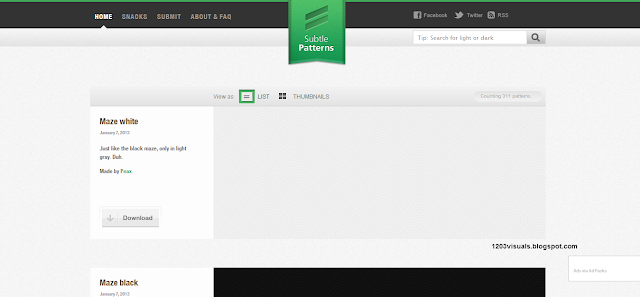
Subtle Patterns: Less is More
Read more »
Today, Americans across the nation are celebrating Martin Luther King Day by paying tribute to Dr. King's legacy as a champion of civil rights. This morning, Google continued its practice of creating an illustration, known as a "Google Doogle," to celebrate holidays, anniversaries, and the lives of famous artists, pioneers, and scientists. Today's doodle is Google's 9th doodle commemorating MLK Day. The first MLK-themed doodle appeared on Google's homepage in 2003, took a brief absence for two years, and re-emerged in 2006.
Read more »
Having studied politics and now working in politics professionally, I am always interested in how the two seemingly unrelated fields intersect. As our President is inaugurated for a second term, I decided to take a look back at the Obama campaign logo. The blue "o" featuring three red stripes is often regarded as one of the most successful political logos of this design era. In a 2008 interview by VSA Partners, Inc., Sol Sender, who spearheaded the logo development for the 2008 campaign, discusses the design process.
Read more »
Social networking has given us a multitude of ways to network and do business. But even with sites like LinkedIn, the business card remains one the most important tools for exchanging contact information- just ask the Japanese! Gone are the days of dull black and white designs. Today, professionals are making more of their first impressions by utilizing innovative designs and printing styles. Below, I have organized a short list of impressive custom styles that are easy to order for print. Not to mention, they would make Patrick Bateman sweat.
This year the European Central Bank is introducing a redesign of euro banknotes known as Europa. If you look at currency around the world, our greenbacks seem to fall flat when it comes to design. At Richard Smith's Dollar ReDe$ign Project dozens of designers have submitted entries of their version of our currency. I flipped through the site and organized some of my favorite facelifts below.
Read more »
 |
| One of These Days I'm Going to Get Organized by Greg Lamarche |
Read more »
Food Network Dishes Out A New Logo
If you are an avid viewer of Food Network like myself, you may have noticed after the New Year the network didn't quite look the same as it did in 2012. Yes, the second season of Rachel vs. Guy: Celebrity Cookoff premiered. However, there was not only a change in programming, but a change in the Food Network logo.
 |
| Before (2003-2012) |
Welcome netizens to 1203 Visuals (that's twelve-oh-three) my little hub on the internet dedicated to discussing graphic design. First and foremost I am glad you dropped by and I hope you stick around to discover something new about the world of design. Moreover, I am excited to hear what you have to say. If there is one thing I've learned about graphic design it is that you never stop learning and growing in this industry. More often than not, the lessons come from peers and professionals. This is what 1203 Visuals will be dedicated to.
Read more »


