Phase 1: Understanding the project
As a student in my vector illustration class, each student was required to enter the contest. The final design would be printed on t-shirts for students. Also, we were constrained to two colors: one being on the color of the shirt and the other being the color of the design. Having completed t-shirt designs before I understood that the design had to be limited in colors (less colors=cheaper to print). I also had to be a design that I knew college students would want to wear.Phase 2: Research and Reference
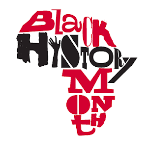
With every project that I start I always research similar logos for inspiration (which is just doing a quick Google image search). This helps me to conceptualize and determine the kind of approach I want to take with the logo. It also helps me to determine what is out there and how I want the logo to stand apart. Many designs often feature hands shaking, or the shape of Africa or iconic figures. I knew this was something I did not want to replicate. Below are some logos that did inspire me.
Phase 3: Conceptualize and Draft
I knew I wanted my design to have movement and to have an organic, hand-drawn feel like the logos above. I was also very drawn to the concept of using hair in the design. The afro is a very iconic image in African American culture, so I chose that to be part of my logo. To achieve the hand-drawn look, I searched various hand drawn fonts and settled on two free fonts: Space Cowboy and Covered by Your Grace. Admittedly, I am not much of a drafter and typically do all of my drafting in-program. I played with the arrangement and used a combination of the letters to achieve the look I wanted. By using more than one font, I was able to sell the concept that it was handwriting vs a set typeface.
Phase 4: Final Design
After adding curls and making the final afro shape this is my result- One in color and a stylized B&W version.


No comments